The weakness of earnings growth has dominated the debate about the recession and recovery in the last few years. “Average earnings” are lower in inflation-adjusted terms than at their recent peak in 2008. This does not (by and large) reflect falling wages for individuals. The average wage has grown more slowly because millions of low paid jobs have been created. Those low-paying jobs have dragged down the average while earnings for those in work have continued to rise relatively strongly. Poor explanation and inadequate “health warnings” have made it easy for economists, the media and observers to get a misleading impression of what’s been happening. When the underlying truth about the statistics fully emerges, there will be a rewriting of history and a realisation that the recession did not plunge so many people into a “cost of living crisis”. The “average” will also be seen for what it is: a dangerous concept when there is rapid structural change in what is being measured.
The background ……….
The annual Green Budget from the IFS, one of the most respected analyses of the UK economy, starts its labour market chapter: “Since the recession of 2008 and 2009, the standout features of the UK labour market have been robust employment and weak earnings. ….. average earnings remain well below their pre-crisis level. In both respects, this recession, and the recovery from it, have been very different from previous ones. Robust employment has meant that fewer people have faced the particularly severe shock of losing all of their earned income. But the falls in (and continued stagnation of) real earnings have meant that the pain from this recession has probably been considerably more widespread.” The IFS chart of real earnings (adjusted for inflation) is reproduced below. (In the last year earnings have picked up and are growing in real terms.)
I realise that even thinking of questioning the IFS is heresy but this could be a very exaggerated, one could even go as far as to say wrong, interpretation of the “reality”. It is true but not fair. The reason for this is explained in the next section on “arithmetic”.

The arithmetic …………
The ONS produced a very good article in May this year that set out the numbers below. This is an illustrative set of numbers that explains exactly what has been happening in the UK in the last few years. They ask you to imagine a labour market of 15 people in year 1. In year 2, two new employees are added and one is lost. The individual earnings of the people are set out below.
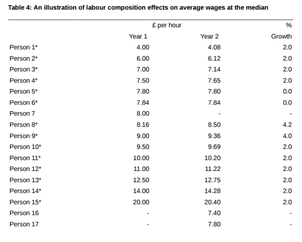
The new employees in year 2 (persons 16 and 17) were at the bottom end of the pay scale. The impact on the median and mean (average) figures are striking as shown in the table below. What look like like very modest changes in composition lead in this case to median earnings growth of 4%, mean growth for those in continuous employment of 2% and “average earnings growth” of close to zero. 12 of the 15 continuously employed people saw their earnings grow by 2% or 4% – not a bad year despite “average” growth of zero!

The arithmetic above was extremely helpful but the article was hidden away where only the most diligent would stumble across it and it related to a set of numbers (released annually) that hardly anyone looks at. Most importantly, the article did not give a full explanation of the consequences of the maths on other data sets – notably by far the most popular series for earnings, those published every month in the main labour market release. Those figures suffer from exactly the same misleading average.
Alas we do not know what the impact is on the numbers. It is impossible for anyone outside the ONS, without access to the base data, to properly quantify the effect. The ONS could have explained more but have not. For that reason, the efforts of the regulator (UKSA), which is there to defend the public interest, have been disappointingly weak.
The regulator ……….
The UK Statistics Authority was established under The Statistics and Registration Service Act 2007 “as an independent body at arm’s length from government ….. with the statutory objective of promoting and safeguarding the production and publication of official statistics that ‘serve the public good'”. In the absence of ONS action, I argue that they should they be issuing the health warnings as the publication, use and misuse of these numbers is not ‘serving the public good’.
UKSA knows about the issue. One letter to UKSA back in March set out the problem. The thrust is repeated here:
“I attach a list of recent quotes from think tanks, media and political figures which I believe are not justified by the data published. It seems that a dangerous misunderstanding has been allowed to arise – and is now widely taken as gospel – that income growth for many workers is weaker, and the “cost of living crisis” greater, than it really is. As far as I understand, the problem is thus:
- the monthly AWE figures are the most widely quoted in the media
- AWE is total pay divided by worker numbers
- it does not allow for a change in the composition of jobs
- there has been very strong growth in job numbers in recent years
- many of these jobs have been at the lower end of the pay scale
- so total pay divided by worker numbers has been very weak
- even though those in continuous employment (the very notable majority) have on average seen decent wage growth.
While the Bank of England and your ONS colleagues might be careful with their descriptions and not mislead, it is very easy for others to confuse the weakness in AWE (a macro-economic measure of earnings growth) with what is happening to individuals or households. Weak AWE might cause a range of problems such as weak tax receipts growth but does not mean that most individuals are suffering a cost of living crisis. Yet that leap has been made by many.”
The letter concluded by expressing the concern: “….. that this widespread misinterpretation of the state of household incomes understates the economic well being of most people in the country. In the run-up to the election it would seem vital to take the opportunity to correct this.”
Sir Andrew Dilnot the UKSA Chair, sent a reply three weeks later. It did not disagree with the main point and shows that the statisticians are fully aware of the problem. Yet, it ended weakly: “….. given the range of important and interesting statistics in this area, it is especially important that users describe them precisely when drawing on them in public debate.” With the economy at the centre of public debate in the election there was as much chance of that happening as pigs flying.
The letter was disappointing and perhaps reflected a nervousness to tackle a big issue of public misunderstanding, and possibly deliberate abuse by politicians and some elements of the media, in the run-up to the election. There was the added problem that the issue did not put the ONS statistics in a very good light. In the eyes of many, correcting misunderstanding is exactly what the UKSA board should be doing. Sadly, their follow through since has also been thin.
What has happened in the last year?
UKSA produced a report (“The Coherence and Accessibility of Official Statistics on Income and Earnings“, February 2015) which set out the problem but with few commitments with deadlines. There has been little visible follow-up.
The ONS did produce this infographic (Explaining the impact that employees entering and exiting has on comparisons of median earnings) that explained the difference between the mean and median in the ASHE survey. That image came from a longer and quite dense article containing the worked example above.
As explained, the main focus of the market and media is (quite understandably) the figures published every month in the main labour market release. In this key release there is no evidence that anything has changed during recent months in an attempt to clarify the meaning of the figures. There seems to be no mention of the danger of averages when labour market composition is changing so rapidly. Sir Andrew says in his March letter that the coverage of earnings in political and media circles is “less precise than I expect to see in statistical releases”. Arguably this important release has fallen short.
The text could be improved in several places. Consider (looking at the bulletin published in November):
- A bullet on the front page of the release says: “Comparing July to September 2015 with a year earlier, pay for employees in Great Britain increased by 3.0% including bonuses and by 2.5% excluding bonuses.” It’s not wrong but it would be more accurate if it said: “Comparing July to September 2015 with a year earlier, total pay divided by the number of employees in Great Britain was 3.0% higher including bonuses and 2.5% higher excluding bonuses.” That would clarify that it is a total amount of pay that is being measured, not the pay of the same group of people in period and period 2. It would alert readers to possible composition effects and could, indeed, the release could also say that for those in continuos employment pay rose by some figure, x%. That would have to be clearly labelled as approximate and estimated on the ASHE and other information.
- Page 17 of the same (November) release says: “The estimates are not just a measure of pay settlements as they also reflect compositional changes within the workforce.” It would be better to exclude the word “just”. The commentary on the same page refers to the fact that “regular pay increased by 2.5%” adding to the misleading impression in a way that reference to the paybill would not. Statements such as “Lower annual growth rates were recorded for September 2015, compared with August 2015, across the private sector, particularly for Finance and Business Services and for Wholesaling, Retailing, Hotels and Restaurants” give the strong impression that something is happening to individuals’ wages not to sector pay as a whole.
- The ONS compounds the problem by setting out each month the real terms changes in “Supplementary analysis of average weekly earnings“. By saying that the series are “calculated for regular and total pay” simply leads the media and all users to equate the whole economy aggregate figures to individuals. It should say that these are paybill figures and quite possibly do not reflect what is happening to most individuals.
- They present the chart below so it is no surprise that there has been widespread gloom about low earnings in recent years. If ASHE is anything to go by, for the vast majority of workers (80-90% perhaps?) the weakness implied by the figures will be unrecognisable. Note that in nominal terms, pay has been trending upwards throughout the period.

There is a note in the release (page 19) which says: “As well as pay settlements, the estimates reflect bonuses, changes in the number of paid hours worked and the impact of employees paid at different rates joining and leaving individual businesses. The estimates also reflect changes in the overall structure of the workforce; for example, fewer low paid jobs in the economy would have an upward effect on the earnings growth rate.” That is too little too late. That note with that phraseology does not stop the misleading impression being gleaned.
In a note from September 2012, “Interpreting Labour Market Statistics“, the following was included: “ONS publishes estimates of Average Weekly Earnings every month. A common misinterpretation is to report these estimates as being purely a measure of pay settlements and bonuses. The estimates also reflect changes in the number of hours worked and the effect of changes in the structure of the workforce.”
It is hard to know why the ONS has not done more and fully explained why, and estimated by how much, the average earnings figures have been artificially suppressed by the same phenomenon – lots of new low paid jobs – so clearly set out for ASHE.
None of the figures above presented by the ONS is wrong, but it is not fair that the ONS presents just one “average”. They should add health warnings. It is a failure that they might pay heavily for if the Bean review focuses on this.
The history ……..
That said the ONS might feel a bit aggrieved that it has this statistic at all. It’s a relatively new one. The history is (probably) best set out in UKSA assessment report no 19 on average weekly earnings dating from 2009. It was that report that deemed that the new AWE statistic met National Statistics standards and was compliant with the code of practice. (The full details can be found in that report. Sadly many of the links to key historic documents in that report are broken as they were not updated when the ONS website was relaunched.)
It would be no surprise if the UKSA assessment team waved the new series through the process without a second thought. That statistic would have been seen as an improvement over its predecessor the “Average Earnings Index” which had had its issues in the years before. In any case UKSA was new and with its limited resources it was not going to question a series that had been produced by the great power-brokers of the statistics world – Andrew Turnbull (then head of the Treasury and future Cabinet Secretary), Mervyn King (then deputy Bank of England governor), Martin Weale (director of NIESR and future MPC member) and under the watching eye of the National Statistician. If that’s what they came up with after the best part of a decade of effort, well ……..
What is revealing (see the Weale report on AWE from June 2008) is that the new measure, AWE, was liked as it expressly included the impact of the changes in labour market composition. One of the four reasons why AWE was deemed “superior” was “unlike AEI, AWE is responsive to the effects of shifts in the composition of employment in the economy on the average wage”. (Para 1.2, page 3) For a macro-economic statistic that is the case, but the figure is always presented as if it relates to the experience of individuals.
To conclude …….
We are where we are. The AWE figure is not wrong. And there is nothing wrong with an average. But there are many times when they are used to draw conclusions that are misleading. It is a very complicated issue and the UKSA board might well have decided, if no one is worrying, to let sleeping dogs lie.
And there does not seem to be a great concern. The Bank of England and Treasury should not be the places to look for concern since the measure was effectively developed at their behest. Though there have been some reports, like this one in the Guardian, that suggest the Bank has been bemused about the earnings trend. A few backbenchers apart, it was perhaps surprising that Conservative politicians seemed not to be over-concerned about the probable inaccuracies in the “cost of living crisis” stories in the run-up to the election. The TUC produced a report in September last year. Unison also wrote about pay settlements and average earnings this year and concluded: “average earnings growth does not offer any kind of sound basis for judging actual changes in the pay packet of a worker in the public or private sector. Pay settlement data forms a much sounder basis for comparison as it eradicates the differences in workforce composition that affects average earnings growth comparisons.”
The Institute for Fiscal Studies has taken a totally different line on labour market composition. For them it is the qualifications of the labour market that matters not the jobs that would-be workers can get. (See chapter two of the 2015 Green Budget, page 44.) They talk of “characteristics of the employed population” and “different worker types”. They say: “we showed that the workforce is continuing to become more highly educated, older and generally more oriented towards skilled occupations. This provides little evidence of a compositional shift towards types of workers who are likely to be paid less, which suggests that the weakness of earnings is due to ‘underlying’ factors – trends for given types of worker – rather than compositional shifts.” There’s more data to analyse on skills but such analysis ignores cases where well qualified people are having to take lower paid jobs for which they are over-qualified! That’s the real world. Sadly if the IFS says something most commentators will believe it. On this one they might be off the mark. True but not fair.

Great piece.
I didn’t understand this bit
‘Note that in nominal terms, pay has been trending upwards throughout the period.’ – why is that relevant? Isn’t the inflation argument a separate one or are you implying the composition matters sufficiently for the inflation adjustment to make it wrong?
I also think your proposed alteration is a bit complex. I think just clearly labelling it the ‘average’ would go a long way to resolving the problems.
But very informative piece.
LikeLike
Thanks for the comment. I have concerns about inflation – that’s for another day! I think a “solution” is two-fold: better labels and sign-posting and also better statistics. Both really have to come from the ONS/UKSA.
LikeLike
Hi Simon
Thank you for the article which introduces concepts which I am sure are new to many of those reading it. Even to someone like me who has followed the issues a new way of thinking is always helpful as anyone who thinks they understand fully where we are is mistaken in my opinion. It is a particular shame that we find ourselves unable to honestly say we can be certain about the wage and hence real wage picture in the UK in the credit crunch era. Let nobody be mistaken that this is a very serious omission as we try to understand fully what the credit crunch has meant to the UK.
I would like to add that the UK wages series has a further problem in that it does not include the self employed which is a bigger and bigger issue as we see that they are a growing percentage of the workforce. They were up 71,000 to 4.61 million in the latest Labour Market Statistical Bulletin which means that they are getting ever nearer to the 5.35 million in the public sector for example and yet the wages numbers exclude them. I did contact the Bean Review of UK Economic Statistics on this matter and very much hope that they will take this forwards. We can and must do much better.
LikeLike
You put it very well: “It is a particular shame that we find ourselves unable to honestly say we can be certain about the wage and hence real wage picture in the UK in the credit crunch era. Let nobody be mistaken that this is a very serious omission as we try to understand fully what the credit crunch has meant to the UK.”
LikeLike
Presumably at least a decent proportion of the mix shift in jobs is *between* industry sectors rather than *within* them. Wouldn’t a straightforward solution be for the ONS to publish AWE and job numbers by industry sector, then we could at least strip out that mix effect? They could even do it for us…
LikeLike
Totally agree. The more breakdowns the ONS can give and the more understanding they can impart, the better for all of us.
LikeLike
They do actually publish some of this eg on this page (http://www.ons.gov.uk/ons/publications/re-reference-tables.html?edition=tcm%3A77-381603) you can get AWE split by sector and by age bracket, as well as an (unhelpfully rounded) weighting factor. Oddly, my quick and naive analysis suggests no mix effect over 2010-2015, but this might well be due to the weightings
LikeLike
Just wanted to provide an update that the Authority has recently published its Progress Report (https://www.statisticsauthority.gov.uk/news/progress-report-on-income-and-earnings-statistics/) and letter to the National Statistician (https://www.statisticsauthority.gov.uk/correspondence/the-coherence-and-accessibility-of-Official-statistics-on-income-and-earnings/), to follow up on the recommendations set out in our Review on The Coherence and Accessibility of Official Statistics on Income and Earnings.
This Progress Report finds that while there have been some positive developments, progress against recommendations has generally been limited or moderate. In particular, progress against those recommendations that require collaborative working within and between government departments has been disappointingly slow. The Authority will be asking the Office for National Statistics, the Department for Work and Pensions and HM Revenue and Customs for a joint progress update in May 2016 that demonstrates more extensive progress. The Director General for Regulation is also considering which National Statistics merit a re-assessment against the Code of Practice for Official Statistics, as part of the 2016/17 Programme of Assessment, which will be published on the Authority’s website in April.
LikeLike
Thank you very much. I suppose we are heading in the right direction – it is just painfully slow for an issue that is SO important. We have known about this for several years – just do the NS assessment now and find the stats failing. Previous work of the UKSA was not as robust as it should have been for reasons that were understandable at the time.
LikeLike